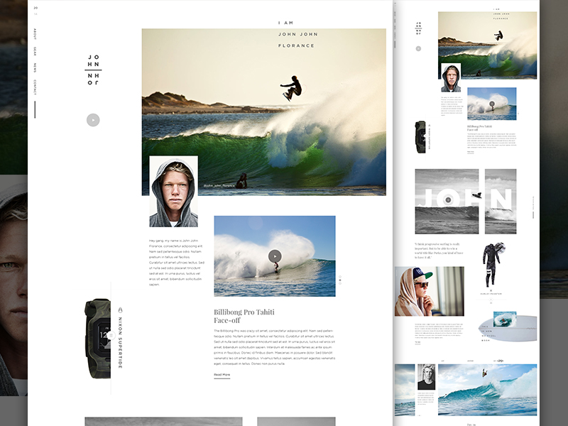
Half man half merman Jack Dusty set sail on the open seas of the interweb. His ship was a simple craft known only as the Dribbbler and his mission was one personal web design project per month for one year. The voyage known as the “Jack Dusty Experiment” started with the simple mission to be creative. There were no clients, restrictions, limitations, or nerves.

Even with no plan a few core themes began to emerge early in the adventure that helped drive the project. These included the use of white space, exploded grids, and visual storytelling. Below is a retelling of the events from Jack Dusty himself.

Est. 1982
Man Overboard I'm Jack Dusty

The Jack Dusty Experiment

Nyjah Houston

1
12
Nyjah Houston Jack Dusty Nyjah

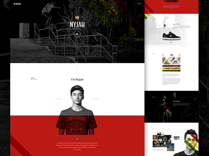
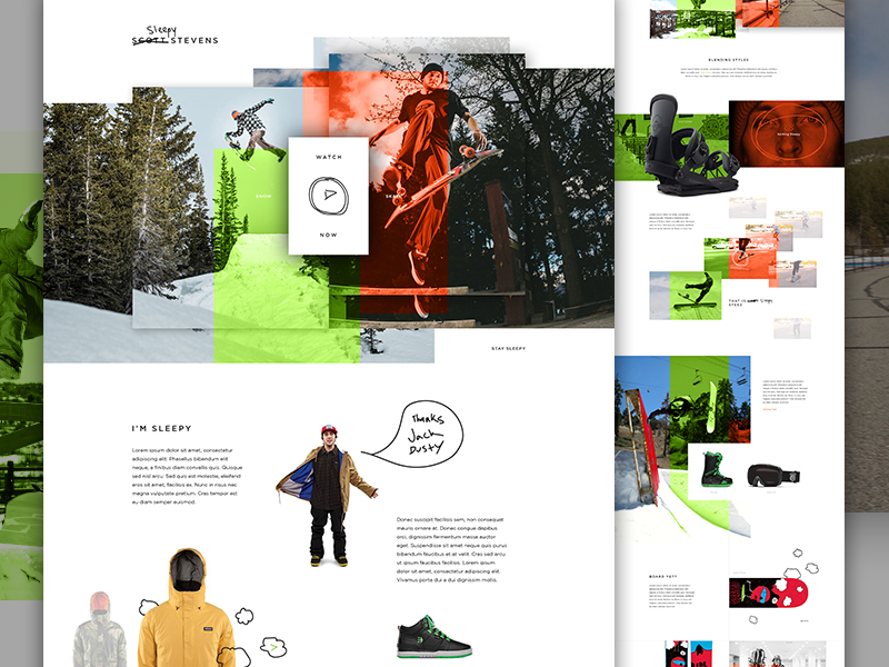
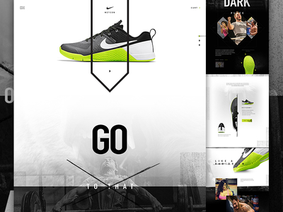
After packing my ship and setting sail I decided to get rolling on a site I thought could use some TLC. Lately I have been really interested in unique ways to sell products through storytelling vs the traditional e-commerce experience and wanted to explore this concept. For Nyjah's site my goal was to promote his own personal brand and sponsors, allowing for a close connection between him and the products he represents.

This was when I really started consciously using the “exploded grid”. Not sure if there is a true definition but for me this is simply breaking the grid vertically and/or horizontally creating more interesting negative space. Elements and white space don't have to align but should balance.

John John

2
12
John JohnJack Dusty John John

I am new to surfing but find it super inspiring and love the free form designs found in many surf magazines. My goal was to capture this feeling and transition it to the web while really playing up the exploded grid. This layout drives users down the page while telling John John’s story in a highly visual way.

Sad but true, this concept almost never saw the light of day, I was super worried it was going to totally flop. Really glad I decided to set this one free as it ended up leading to many interesting projects and connections.

Brand On

3
12
Brand OnJack Dusty Brandon Johnson

My brother had a basic free website because “he didn't want to bother me” but I saw this as the perfect opportunity to take semi dry content and make it exciting. The design concept was based off a secret mission/government document hence the mono type font and highlighted links. Many of my designs are relatively flat but with a few key elements and overlapping breaks this one really began to pop.

I love using a zig-zag vertical flow but for this layout I used an hourglass approach going from wide to narrow. The logo and my brother's personal “On” brand was super random but I loved tying this in as an easter egg.

Jack Dusty Grid Jack Dusty Grid Jack Dusty Grid Jack Dusty Grid
Jack Dusty Grid

You can’t walk on the moon without a space suit #awesomequote #imjackdusty

“This was when I really started consciously using the exploded grid.”

Scott Stevens

4
12
Scott StevensJack Dusty Scott Stevens

This was one of the fastest designs of the experiment, it almost felt like an out of body experience. I wanted to capture Scott's unique style and multi sport skills. Once I came up with the idea of a 50/50 split (left snow, right skate) amplified by the dueling color overlays everything just emerged. For me this is what design is all about, being creative, being in the moment, and living the project. It is a great example of having fun and taking risks.

I felt like a sea monster making this layout... slithering through white space by pulling elements all the way left/right creating an “s” flow. I love just going for it and this design truly inspired me moving forward.

The Boss

5
12
The BossJack Dusty The Boss

I actually do love rap music and Rick Ross so it seemed only right to create a design for the launch of his new album. Hood Billionaire was on repeat throughout this entire design and inspired many of my decisions. I sketch before each project and this design was no different but sometimes happy mistakes make things even better. I dragged a gold background layer by mistake and loved the large color block showing through. This simple slip totally changed the entire design moving forward.

The player was the toughest part of this design. I knew I had to do something different to fit the exploded layout and it actually hit me while going for a McD's coffee break (obsessed with McDonalds coffee). Now I try to get away from the computer and go for a walk/sail/swashbuckle whenever feeling stuck.

Esee Knives

6
12
Esee KnivesJack Dusty Esee Knives

Growing up I had a little knife collection, for some reason it has been rekindled at 32. I felt like I had a pretty solid concept going into this design but the history and lower product section drove me crazy. I honestly tried about 10 options before it finally came together.

The biggest breakthrough with this design was continuing to push using different shapes and details creating tactical/tech undertones. Using repeating shapes to generate such simple yet interesting elements really got me excited about this layout. Why force yourself to only use squares and circles?

Now at the halfway point I began to get overwhelmed knowing I had 6 more to go. I just had to remember to go for it and trust myself.

Beck

7
12
BeckJack Dusty Beck

I was a big Beck fan back in the day... I'm a loser baby... but honestly had not listened to much of his new music until he won the Grammy. I checked out his current site and thought this was my next adventure! Only listening to Beck's music and studying his funky micro sites helped me evolve this design from a true high level concept vs sketching the actual elements and details.

This became more of a collage experiment creating tons of fun little details, messed up type, and weird layering all while still sticking to a similar exploded grid. Designing this was one of the more freeing projects of the experiment and felt super “dusty”. I would recommend all designers try a concept like this, it is amazing how many ideas I have pulled from this design into other projects.

Nike Metcon

8
12
Nike MetconJack Dusty Nike Metcon

During this experiment I was informally offered a job as an Art Director at Nike. They had found my work after seeing the John John design. My mission now was to create a Nike site to prove to myself that I could “Just Do It”. This was also my first project post Epicurrence where I had connected with many of my design idols... the pressure was on.

I had a huge creative block starting this concept because I was getting away from the project being fun. Once I got over trying to prove something and remembered my original mission everything became clear again. For me this was one of the most successful designs from full concept to final execution, really telling a story by blending athletes and products. The layout began to take on it's own living breathing personality.

THE 29

9
12
The 29Jack Dusty THE 29

I grew up hunting with my Dad and have gotten back into it the last few years. Totally understand it is not for everyone but I wanted to create a design about my Dad's archery quest for all 29 North American Big Game. I was super happy with the design but surprised by the response, this ended up being my most popular concept of the project. It goes to show that beautiful photos and typography are always a hit. Throw in some line work, interesting white space, unique details, and grid breaking stamps... bullseye.

J. Crew

10
12
J. CrewJack Dusty J. Crew

Gradients often times get a bad wrap even though they can create super interesting effects. For this design I reversed my process and had the design idea first before picking the topic/brand. Wrong idea, the reversal coupled with being rushed made this my personally least successful design. I do think elements inspired me for the following PRod concept but something was missing in this one. Old Dusty should have started over on this design but I just didn’t have time. You gotta know when hold them, know when to fold them....

I would like to continue exploring and bringing gradients back into my work. They are popping up more and I have a feeling they will be making a comeback soon.

“I have been really interested in unique ways to sell products through storytelling vs the traditional e-commerce experience.”

Elevating a concept through personality is what separates a quality design from an amazing one. There is an intangible element that is just there when a concept comes together. I want to bring this to every project and believe the next evolution of e-commerce will focus more on storytelling and the emotional connection between products and shoppers.

Jack Dusty Grid

NIXON PAUL RODRIGUEZ

11
12
NIXON PAUL RODRIGUEZJack Dusty NIXON PAUL RODRIGUEZ

Picking my last muse/concept was tougher then imagined but I figured this would be a perfect chance to bring everything full circle. My mission was to take all the things I had explored and incorporate them into one final design. It had exploded grids, interesting white space, a zig zag flow, unique typography, overlays, collage, e-commerce storytelling, repeated shapes, and depth.

It was tricky to pull all these elements in and have a working design. I was really proud of this concept because it shows an evolution in my design style and approach.

Hope you enjoyed this experiment as much as I did. Big thanks to Chris LaRose and Nick Ano for always being my most honest critics and thank you to the Dribbble community for the amazing feedback and kind words!

Est. 1982 Top Takeaways